INDUSTRY:

INDUSTRY:

INDUSTRY:

ED-TECH

ED-TECH

ED-TECH

YEAR:

YEAR:

YEAR:

2025

2025

2025

Redesigning SuperKalam’s Cancellation Flow to improve trial retention.

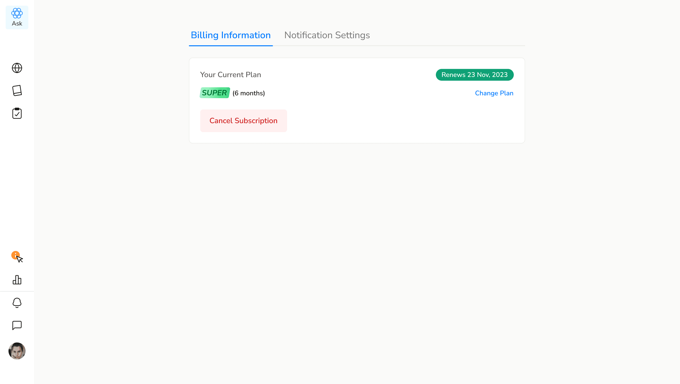
SuperKalam is an edtech platform designed to help students prepare for UPSC exam. With a focus on affordability, accessibility, and personalization, it offers structured plans, curated content, and mentorship — all built to empower students on their self-paced learning journey.

🚨 The Problem

Students were subscribing to SuperKalam’s ₹15 trial… and instantly canceling. The culprit?

Auto-pay fear. Most users didn’t even explore the platform before opting out.


The original cancellation flow was functional — click, cancel, done.
But it lacked context, emotion, or pause. We needed to give users a reason to stay, without pressuring them.

🔍 Research & Insights

We started with:

We started with:

  • Internal data showing early drop-offs within the first 30 minutes

  • User behavior interviews with trial users

  • A quick benchmark of cancellation flows from platforms like Notion, Canva, Figma, and Loom

  • Internal data showing early drop-offs within the first 30 minutes

  • User behavior interviews with trial users

  • A quick benchmark of cancellation flows from platforms like Notion, Canva, Figma, and Loom

Key Takeaways:

Key Takeaways:

  • Most platforms create a “pause moment” with benefit reminders or emotional visuals

  • Humor and empathy worked better than urgency

  • Edtech audiences (especially UPSC students) didn’t want to feel tricked — just informed

  • Most platforms create a “pause moment” with benefit reminders or emotional visuals

  • Humor and empathy worked better than urgency

  • Edtech audiences (especially UPSC students) didn’t want to feel tricked — just informed

✏️ The Design Approach

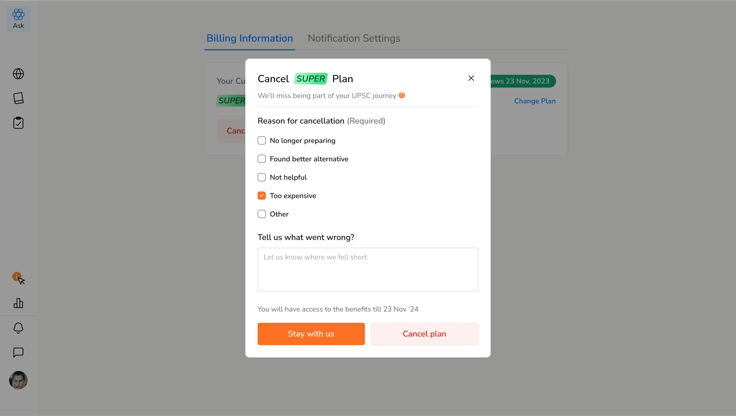
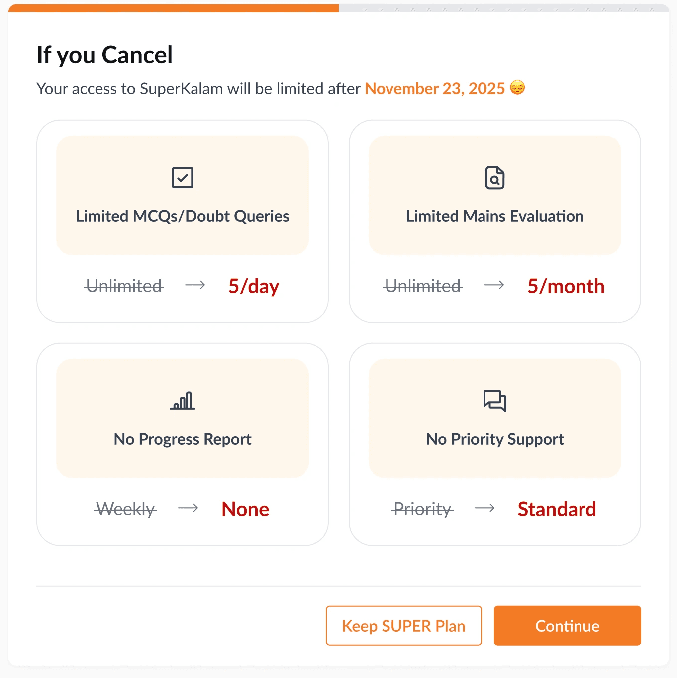
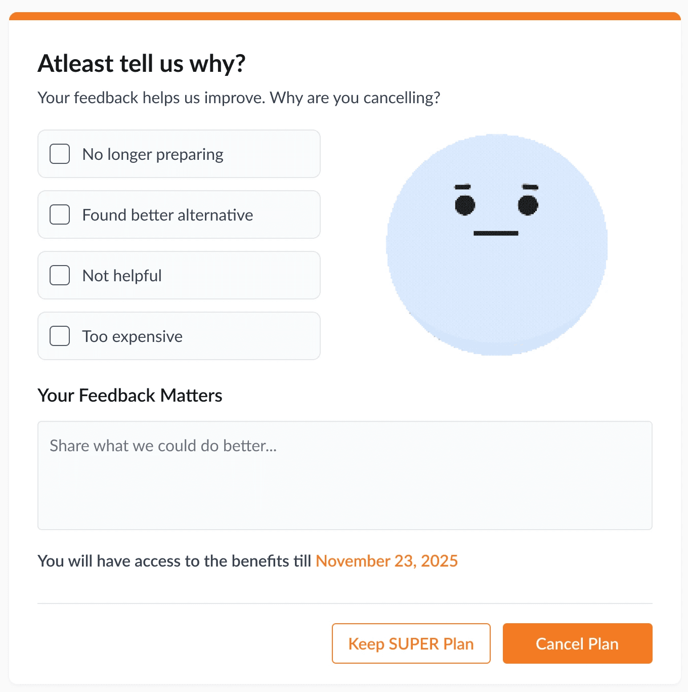
Our redesign focused on empathy over pressure, with two small but powerful additions:

1. Benefits Reminder Screen

Before cancellation, users now see a lightweight reminder of what they’ll lose — curated content, mentorship, custom plans, etc.
It’s not manipulative. It’s just… a moment to think.

2. More interactive Feedback Screen

Instead of a dry form, we added a subtle animated sad-face GIF to humanize the flow.
It’s soft, a little funny, and made users pause — “Are you sure you want to go?”
Also we added a text animation in the feedback box which encourages users to add textual feedback.

✨ Final Flow
✨ Final Flow
✨ Final Flow
🎯 Learnings & Outcome

Honestly, this project wasn’t about fancy UI. It was about restraint. About knowing when not to be clever.

Here’s what I took away:

  • Subtle design > sneaky design: We didn’t trap the user. We just made them pause.

  • Emotion matters: That tiny sad GIF sparked more discussion than any layout decision.

  • Good UX respects choice: We reminded, not redirected.

While I wasn’t able to track exact retention numbers post-launch (since I was an intern), internal reviews were super positive.
The new flow was launched live and aligned with the Growth team’s goals to create a student-first experience — one that nudges, not nags.

While I wasn’t able to track exact retention numbers post-launch (since I was an intern), internal reviews were super positive.
The new flow was launched live and aligned with the Growth team’s goals to create a student-first experience — one that nudges, not nags.

🚨 The Problem
🚨 The Problem

Students were subscribing to SuperKalam’s ₹15 trial… and instantly canceling. The culprit?

Auto-pay fear. Most users didn’t even explore the platform before opting out.


The original cancellation flow was functional — click, cancel, done.
But it lacked context, emotion, or pause. We needed to give users a reason to stay, without pressuring them.

Content

  • Let's Talk

    +++

    Let's Talk

    +++

    Let's Talk

    +++

    Let's Talk

    +++

    Let's Talk

    +++

    Let's Talk

    +++

    Let's Talk

    +++

    Let's Talk

    +++

    Let's Talk

    +++

    Let's Talk

    +++

    Let's Talk

    +++

    Let's Talk

    +++

    Let's Talk

If you’ve got ideas or just want to chat, drop me a line.

We’ll make something cool.

If you’ve got ideas or just want to chat, drop me a line.

We’ll make something cool.

🚨 The Problem
🚨 The Problem

Students were subscribing to SuperKalam’s ₹15 trial… and instantly canceling. The culprit?

Auto-pay fear. Most users didn’t even explore the platform before opting out.


The original cancellation flow was functional — click, cancel, done.
But it lacked context, emotion, or pause. We needed to give users a reason to stay, without pressuring them.